

Choosing the right colors for an outfit can feel like a puzzle, but with a clear method and a few timeless principles, anyone can turn a simple wardrobe into a runway‑ready collection. In a boutique setting, where every piece is curated for quality and style, mastering color coordination not only amplifies personal confidence but also maximizes the value of each purchase. This guide breaks down the science of the color wheel, the art of seasonal palettes, and the practical steps you need to match colors in outfits, ensuring every look you create feels intentional, balanced, and unmistakably fashionable.
Understanding the Color Wheel: The Foundation of Coordination
The color wheel is the map that designers use to explain how hues interact, and it remains the most reliable tool for building harmonious outfits. At its core, the wheel separates colors into primary (red, blue, yellow), secondary (green, orange, violet), and tertiary shades, each positioned relative to one another. When you visualize this circle, you’ll notice that colors directly opposite each other—known as complementary pairs—create the strongest visual contrast, while those side‑by‑side generate subtle, soothing blends. Knowing these relationships lets you decide whether you want a bold statement or a muted, cohesive look.
For boutique shoppers, the color wheel can be applied instantly: hold a garment up to a printed wheel or use a digital app to see its position. A burgundy dress, for instance, sits between red and violet, meaning it pairs naturally with deep greens, soft pinks, or even muted neutrals like camel. By referencing the wheel during the fitting process, you can quickly test multiple combinations without guessing, turning every try‑on into a strategic styling session.
Complementary Colors: Creating Dynamic Contrast
Complementary colors—those located opposite each other on the wheel—inject energy into an outfit by highlighting each hue’s intensity. When paired correctly, they produce a striking balance that feels both daring and polished. Think of a classic navy blazer with a bright orange scarf; the two tones amplify each other’s vibrancy, drawing the eye without overwhelming the wearer. In a boutique environment, complementary pairings are especially useful for accent pieces such as shoes, bags, or jewelry, allowing you to keep the main silhouette neutral while still making a bold statement.
To avoid visual overload, apply the 80/20 rule: let one color dominate (about 80 percent of the outfit) and introduce its complement as an accent (the remaining 20 percent). A teal midi dress paired with a coral belt follows this principle perfectly—teal remains the focal point, while the coral adds a pop of excitement. This approach ensures the outfit stays cohesive and wearable, a key consideration for customers who want to invest in versatile pieces that transition smoothly from day to night.
Analogous and Monochrome Schemes: Effortless Elegance
Analogous colors sit next to each other on the wheel, sharing similar undertones that create a seamless, harmonious look. When you combine shades like mustard yellow, burnt orange, and rust red, the result is a warm, cohesive palette that feels naturally put together. This technique is ideal for boutique shoppers who prefer understated sophistication; it allows you to layer multiple garments without worrying about clashing, making the outfit appear thoughtfully assembled rather than accidental.
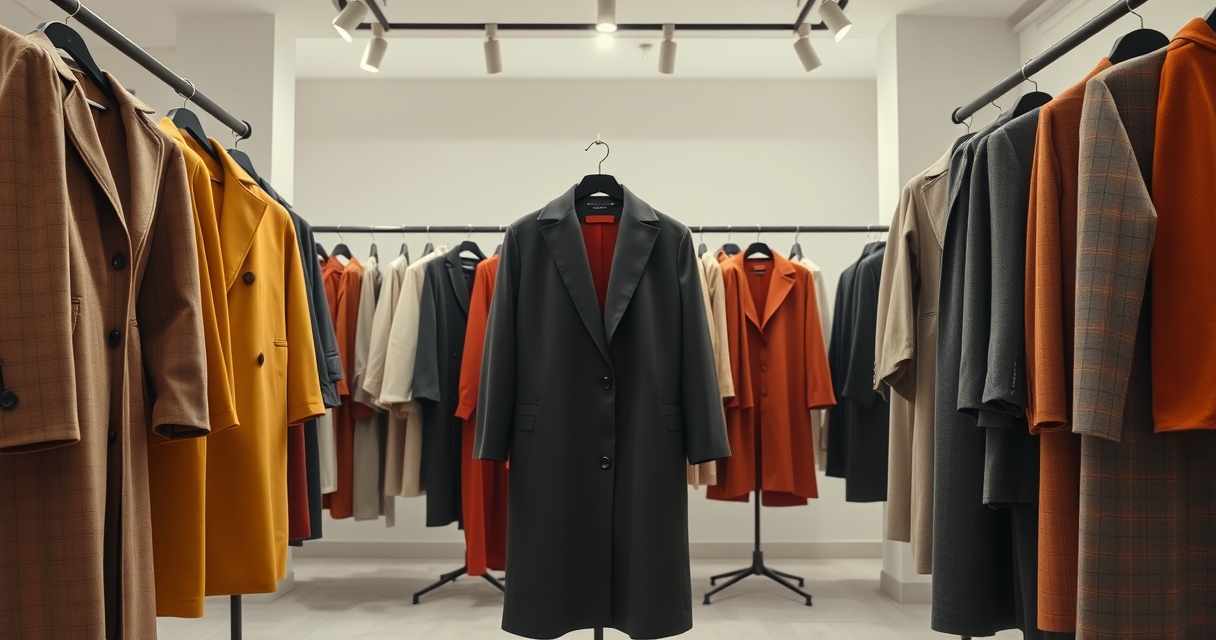
Monochrome styling takes the concept a step further by using variations of a single hue—from light pastel to deep shade—throughout an entire look. A charcoal suit paired with a light gray shirt and charcoal suede shoes exemplifies this strategy, offering depth while remaining visually calming. The key to successful monochrome dressing lies in texture and fabric contrast: mix a smooth silk blouse with a textured wool coat to keep the outfit from feeling flat. In a boutique, where fabrics are often high‑quality and distinctive, playing with material differences enhances the monochrome effect and showcases the craftsmanship of each piece.
Seasonal Palettes: Adapting Color Choices to Weather and Trends
Seasonal color palettes reflect both natural lighting and fashion cycles, guiding you toward shades that feel appropriate for a given time of year. Spring favors fresh pastels—soft lilac, mint green, and buttery yellow—while summer welcomes vibrant jewel tones like sapphire, emerald, and magenta. Autumn shifts to earthy hues—olive, mustard, and deep burgundy—whereas winter embraces stark contrasts such as black, white, and icy blues. Aligning your outfit with these seasonal cues not only feels instinctively right but also keeps you current with runway trends that boutiques frequently curate.
When shopping in a boutique, ask staff about the current seasonal collection; they often have curated color stories that can inspire your wardrobe. Pair a rust‑colored sweater with navy trousers for an autumn‑ready ensemble, or match a pastel pink blouse with ivory culottes for a spring‑fresh look. By integrating seasonal palettes, you can layer pieces throughout the year—using the same core garment but swapping accessories to reflect the changing palette, thereby extending the lifespan of each purchase.
Texture and Fabric: How Material Influences Color Perception
The way a color appears can change dramatically depending on the fabric’s texture, weight, and finish. Shiny materials like satin or silk reflect light, making colors appear brighter and more saturated, while matte fabrics such as cotton or linen absorb light, giving hues a softer, more subdued vibe. Understanding this nuance helps you decide which pieces to pair for a balanced outfit. For example, a glossy emerald silk skirt paired with a matte ivory cashmere sweater creates a sophisticated contrast that feels both luxurious and approachable.
In a boutique setting, the tactile experience is essential. Run your fingers over a velvet blazer to sense its depth; the rich pile will deepen the perceived color, allowing you to pair it with lighter tones without the outfit feeling heavy. Conversely, a lightweight chambray shirt in a muted blue can serve as a neutral base for brighter accessories. By considering texture alongside hue, you ensure that each component of your ensemble works together visually and sensorially, delivering a polished look that highlights the quality of the boutique’s selections.
Signature Pieces: Building a Cohesive Wardrobe Around a Color
Developing a signature color—whether it’s a bold red coat, a deep navy trench, or a soft blush cardigan—provides a reliable anchor for countless outfit combinations. Choose a hue that resonates with your personal style and complements your skin tone, then use it as a foundation for layering and accessorizing. This strategy simplifies daily dressing decisions and creates a recognizable aesthetic that can become your fashion hallmark.
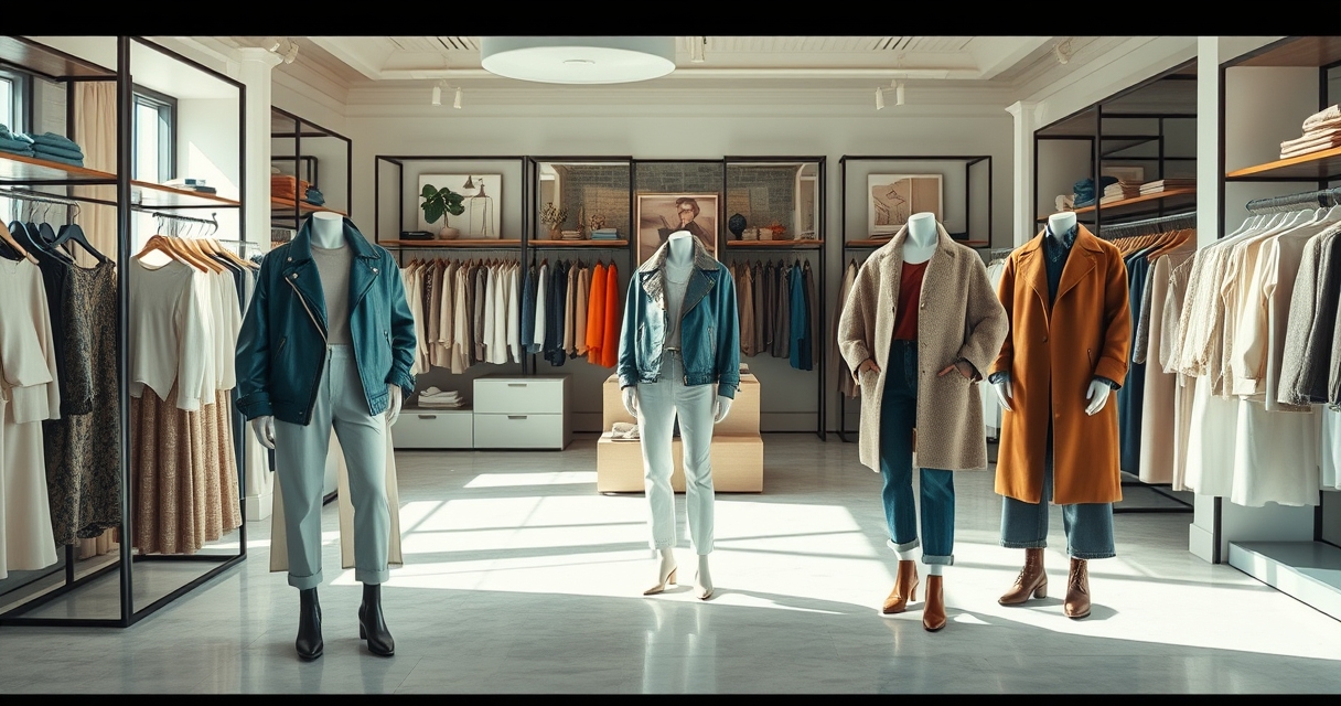
When you identify a signature piece in a boutique, consider how it interacts with the store’s curated collection. A teal leather jacket, for instance, can be matched with a range of neutrals—white tee, beige chinos, or gray denim—while still allowing for occasional pops of complementary orange or analogous blue. By consistently returning to a core color, you can mix and match new arrivals without the risk of clashing, ensuring each purchase feels like a strategic addition rather than an isolated experiment.
Practical Tips for the Boutique Shopper: From Fitting Room to Checkout
Start every styling session by selecting a base garment—typically a top or bottom in a neutral tone—then experiment with color accents using scarves, belts, shoes, or jewelry. Keep a small color wheel or a smartphone app handy to visualize relationships on the spot. When you try on a piece, step back and assess the overall balance: does the outfit feel too busy, or does it lack visual interest? Adjust by adding or removing colored accessories until you achieve the desired harmony.
Finally, remember the power of the “try‑on test.” Take photos of each combination you create in the fitting room; lighting can change the perception of color, and a quick snapshot will reveal whether the hues truly complement each other. Trust the boutique staff’s expertise—they often know which pieces are designed to work together and can suggest pairings you might overlook. By following these steps, you’ll leave the boutique with outfits that not only match colors flawlessly but also reflect a refined, confident style that lasts season after season.

I’ve always loved curating unique looks and exploring how personal style can tell a story. Working as a freelance fashion enthusiast, I enjoy discovering emerging designers and sharing practical tips for building a timeless wardrobe.